Calendar
Last updated
Last updated
The Avonni Calendar component provides an excellent way to display and manage events, tasks, schedules, and more directly within your Salesforce Experience Cloud site. Its intuitive design and customizable features enhance user experience and scheduling capabilities.
This essential step in configuring your Avonni Calendar component establishes the connection between your calendar items and the relevant data within your Salesforce environment.
The data source determines what information your calendar will display.
You have two options to use the Data Source
Manual
Manually input events and resources directly into the calendar interface.
One-time events, or situations where you don't need the calendar to be linked to your Salesforce data.
Query
Automatically pull event and resource information from your Salesforce data. You can create a custom query to display data from any Salesforce object.
When you want your calendar always to show the most up-to-date information from your Salesforce records.
Manual:
Add events and resources directly within the calendar interface.
Useful for one-time events or when you don't need to link data to Salesforce.
Query:
Pull information directly from your Salesforce data.
Create a custom query to display data from any Salesforce object on the calendar.
It is ideal when your calendar needs to reflect up-to-date information from Salesforce.
To ensure your Avonni Calendar displays the most relevant information, you'll need to configure where its data comes from. This process involves selecting the right Salesforce object, and optionally applying filters, grouping, and sorting to refine the results.
Let's break down the steps:
Object Selection: Begin by choosing the specific Salesforce object (e.g., Accounts, Opportunities, custom objects, etc.) that contains the data you want your Kanban board to display.
Optional Filtering: If you wish to display only a subset of data from the selected object, use the filtering feature to set specific conditions. For instance, you might filter to show only "Open" opportunities or accounts within a certain region.
Grouping (Optional): Group your data to effectively organize your Kanban board. For example, grouping opportunities by "Stage" can create columns for "Prospecting," "Negotiation," etc.
Sorting: Select an "Order By" field and direction (ascending or descending) to determine the order in which the Kanban cards should appear.
Additional Fields: If you need to include fields in your Kanban that aren't directly used for display or interactions, add them in the "Additional Fields" section. This is particularly useful for fields you want to be searchable within Kanban's search bar.
Data mappings are the key to ensuring that events from your Salesforce records are displayed correctly on your Avonni Calendar. Think of it like translating information from Salesforce into a language your calendar understands.
Essential Mappings
Here's a breakdown of the most common mappings you'll need to configure:
Title: The Salesforce field containing the event name or title (e.g., "Subject" on the standard Event object).
Resource Name: The field indicating which resource the event is assigned to (e.g., a "Room" field for room bookings or an "Owner" field for sales appointments). If this is left blank, all events will appear together.
From: The Salesforce field that holds the event's start date and time (e.g., "StartDateTime").
To: The Salesforce field that holds the event's end date and time (e.g., "EndDateTime").
Example:
If you're creating a meeting room booking calendar, you might map the following fields:
Title: Meeting Subject
Resource Name: Room Name
From: Scheduled Start
To: Scheduled End
The Avonni Calendar offers three distinct display formats to cater to different scheduling and organizational preferences. Each format provides a unique way of viewing and interacting with your events and resources.
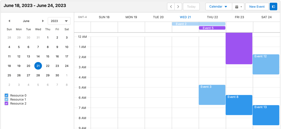
Calendar
This is the traditional grid-based view that most people associate with calendars.
Agenda
Each entry in the list includes details about the event and is arranged in chronological order.
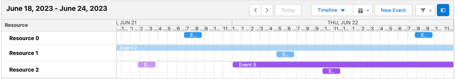
Timeline
Gives users a linear visual representation of their schedule over a selectable period.
The Avonni Calendar offers two ways to display your timeline view:
Horizontal Timeline:
Events are arranged horizontally across the screen, with the timeline running from left to right.
Ideal for visualizing schedules over a longer period (e.g., weeks or months).
Vertical Timeline:
Events are stacked vertically, with the timeline running from top to bottom.
This view works well for seeing detailed schedules within a day or a few days.
The 'Hidden Displays' option prevents users from selecting certain views when interacting with the Avonni Calendar.
The "Zoom to Fit" setting automatically adjusts the calendar view to ensure all scheduled events fit on the screen without scrolling. Here's how it works and when it's most helpful:
How it works
The calendar will shrink or expand its timescale to accommodate all events within your selected view (day, week, etc.).
Benefits
Quick overview: See all your scheduled events at a glance.
No scrolling: Avoid scrolling up and down to find events.
Things to keep in mind
With many events or on very small screens, the compressed view might make individual event details harder to read.
Toolbar Title: Set a custom title for your calendar's header. This helps users understand the calendar's purpose (e.g., "Sales Team Schedule," "Upcoming Events," etc.).
Hide Toolbar: You can hide the entire toolbar to achieve a more streamlined look or maximize the calendar's display space.
The Avonni Calendar component goes beyond just displaying events; it provides a range of ways for your users to interact with it directly and trigger further actions.
New Event Actions: Customize what happens when users drag their cursor across the calendar to schedule a new event. For example, you could automatically open an event creation form.
Header Actions: Add custom buttons to the calendar's toolbar. These buttons can be programmed to trigger any of the available interactions listed below.
Context Menu Actions: These buttons appear when a user right-clicks on an event or opens the event details. Configure these buttons to allow actions like editing, deleting, or triggering additional processes related to the event.
The Avonni Calendar component offers several interactions that can be triggered by the actions described above:
Show Toast: Display a brief notification message to the user, confirming an action or providing feedback.
Navigate: Redirect the user to a different page within your Experience Cloud or external website.
Open Alert Modal: Present a pop-up window with important information or a confirmation prompt.
Open Confirm: Display a confirmation dialog asking the user to verify an action (e.g., deleting an event).
Open Flow Dialog: Launch a Salesforce Flow, enabling you to automate complex processes or guide users through several steps.
Refresh Query: Update the calendar display with the latest data from Salesforce.
To configure these actions and interactions, you'll work within the Avonni Calendar component's settings in Experience Cloud Builder. Each action type (New Event, Header, Context Menu) will have a section where you can define the interaction to be triggered.
The Avatar section allows you to add a picture or image to the header of your Avonni Calendar. This can help personalize the calendar and provide a visual identifier.
Avonni Calendar's Time Span settings offer flexibility in viewing events and managing your schedule. Choose from these options:
Day View: You can focus on a single day or customize it to see multiple consecutive days (e.g., view a 4-day workweek).
Week View: See a full week's schedule at a glance.
Month View: Get a broader overview of the month, with the ability to display 2-4 weeks at a time or a custom number of weeks.
Each time span (Day, Week, Month) has its settings:
Label: Give your time span a descriptive name (e.g., "Work Week").
Icon Name: Select a visual icon to help identify the time span quickly.
Unit: Choose whether this time span represents days, weeks, or months.
Span: Set the number of units to be displayed (e.g., 5 days, 2 weeks).
Fine-tune your Timeline view headers to show the information most important to you, such as week numbers, dates, or months'.
The Available Times section provides multiple options to customize the time frames that appear on your calendar. This feature is handy for focusing on specific periods of interest. Here are the available options:
Days
This option allows you to specify which days of the week should be visible on the calendar. If selected, the calendar will only display the chosen days, effectively hiding the rest.
Month
Like the Days option, you can choose which months should be visible on your calendar.
Time Frame
Using the Time Frame, you can precisely control the hours visible on your calendar, effectively focusing on the time slots most.
The Event Display section offers a range of options to customize the visual aesthetics of your calendar events.
Here are the available options:
Theme: This option lets you choose a visual theme for your events. You can select from several preset themes, such as default, transparent, line, hollow, or rounded, each offering a unique visual style to suit your personal preference or brand identity.
Palette: This feature lets you assign different colors from a chosen palette to each resource. A color palette is a collection of colors that provide consistent color usage across different resources. This helps visually differentiate and quickly identify different types of resources on your calendar.
Popover Fields: When a user hovers over an event, these fields will be displayed in a small popup box (or a 'popover'). This allows users to view essential event details without clicking on them.
Customize how users refine the events displayed on your Avonni Calendar.
Hide Resources Filter: Choose this option to remove the filter that allows users to view events based on specific resources (e.g., people, rooms, equipment).
Hide Date Picker: Select this to remove the calendar icon on the header that lets users navigate to a specific date.
Type (Horizontal, popover, left panel, right panel, vertical): Determine the visual style and placement of the filter section:
Horizontal: A bar across the top of the calendar.
Popover: A compact filter that opens when clicked.
Left/Right Panel: A side panel for filter options.
Vertical: A vertical list of filter options
Show Search: Enable this option to add a search box to the top of your Avonni Calendar, allowing users to find specific events quickly.
Placeholder: Add a short phrase (e.g., "Search events...") to guide users on what they can search for within the calendar.
Position (left, right, center, fill): Choose where to place the search box within the calendar's header for the best visual layout.
Width: Sets the horizontal width of the calendar. You can use fixed values (pixels, percentages) or let the calendar adapt based on its container.
Height: This setting sets the calendar's vertical height. Similar to width, you can use fixed or flexible height settings.
Overflow: Determines how the calendar handles content that exceeds its dimensions. Options might include:
Visible: Content flows outside the calendar.
Hidden: Content is clipped at the calendar's edges.
Scroll: The calendar gains scrollbars if the content overflows.
Background Color: This setting sets the background color of the calendar's toolbar (the area typically containing navigation buttons, view selection, etc.).
.avif?alt=media&token=b076a6cd-2832-4477-bbc0-92d8f7acda94)